See more
(ML)
DESIGN DIRECTOR
Tokyo, Japan (JST)
00
:
00
:
00
AM
Menu
Close
Fuji+: Reimagining a leading Japanese streaming platform
BRAND
experience
(Project summary)
By 2021, online streaming had become one of the primary ways audiences consumed entertainment and media. Global players like Netflix were rapidly reshaping expectations in Japan, putting pressure on domestic broadcasters to evolve.

Fuji Television Network (Fuji TV) launched Fuji TV On Demand (FOD) in 2012 as its flagship streaming service. Over the following decade, FOD grew into one of Japan’s leading domestic platforms. With the introduction of FOD Premium in 2019, Fuji TV set its sights on strengthening its digital business and expanding its footprint in the streaming space.

To mark FOD’s ten-year anniversary and accelerate Fuji TV’s shift toward online services, the company initiated Fuji+—a conceptual project to define the next-generation brand and service foundation for its streaming ecosystem.
(The project in numbers)
1m
Total number of Premium+ subscribers
+317%
User satisfaction (NPS) uplift
+1.7
AppStore & Google Play store rating improvement
$2.3m
Estimated annual revenue impact
Fuji+ identity in action across media
Fuji+'s new branding strategy
(Mission, Vision, and Positioning)
Defining the mission, vision, and positioning for Fuji+ was a critical step that would ultimately determine the project’s success. Together with the Fuji TV project team, LNM Production conducted in-depth research, stakeholder interviews, and cross-functional workshops with staff and managers across the organization.

These conversations clarified each group’s goals, challenges, and long-term ambitions for Fuji TV’s digital future. The insights became the foundation for the initial service concepts, which we used for rapid, agile prototyping and validation.
Fuji+ brand vision
Revised brand positioning for Fuji+
Our unified brand objective for Fuji+
(Service naming)
With the core concept in place, the team turned to naming. We wanted to honor Fuji TV’s legacy and existing brand architecture—services such as FOD (Fuji TV On Demand) and FNN (Fuji News Network)—while signaling a step-change toward a more integrated, future-oriented platform.

We retained “Fuji” as the core brand asset and added a simple “+” to express expansion, aggregation, and added value. The result, “Fuji+”, is a name that is easy to remember, flexible across use cases, and scalable as the service grows.
Our naming journey for the future Fuji+ brand
Shortlisted and validated names for the new service
Validation results, including negative and trademark checks
(Service slogan)
To support the brand’s vision and ensure consistent, resonant communication with users, we also developed a new slogan for Fuji+.

The slogan needed to:
- Be short and memorable
- Work naturally in both English and Japanese
- Clearly differentiate Fuji+ from competing services

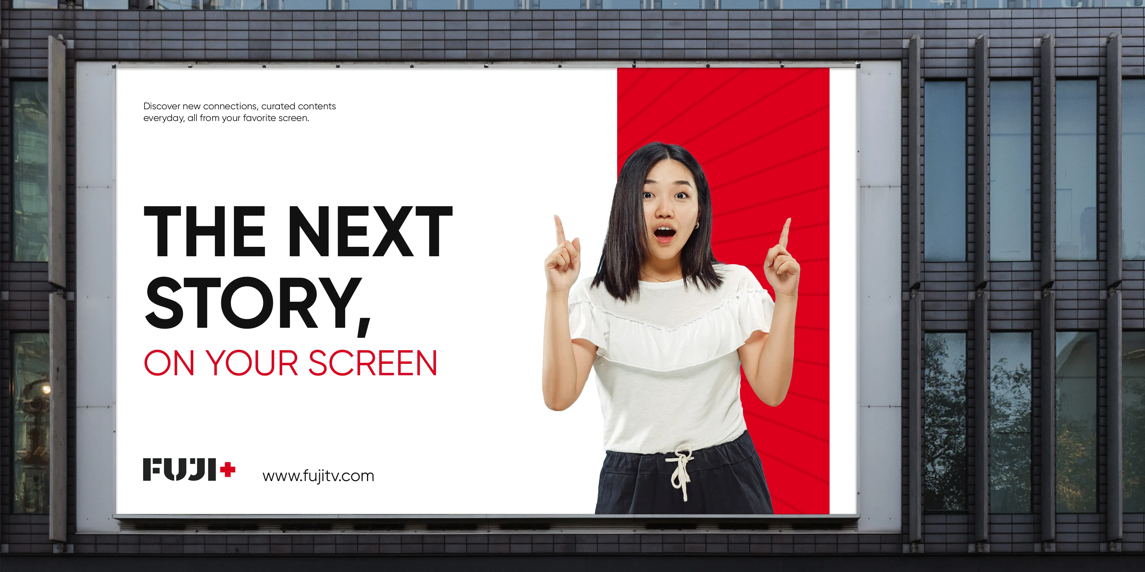
After multiple rounds of exploration, drafting, and internal debate, the team landed on: The Next Story, On Your Screen (in Japanese: 次の物語を、あなたの画面で). The line captures Fuji+’s role as a platform where audiences can discover whatever comes next for them—new stories, new voices, and new communities—delivered directly to their personal screens.
Fuji+'s new brand claim and slogan
Structure of the Fuji+ brand claim and slogan
Multilingual adaptation of the Fuji+ slogan
Fuji+'s slogan in OOH executions
Fuji+'s new visual identity
(Brand Core Values & Design Principles)
To define the visual direction for Fuji+, we first needed clarity on what the brand should stand for. Through interviews and workshops with Fuji TV’s primary stakeholders, we articulated three core brand values:
- Adaptive
- Principled
- Leading

From these values, we derived three brand design principles to guide all visual decisions:
- Simple
- Modern
- Open
Fuji+'s newly defined brand promises and values
Developing design principles as the North Star for Fuji+'s identity development
(The logotype)
Inspired by Fuji+’s mission to “foster communities of like-minded audiences,” the new logotype was built from “broken pieces” of different shapes and sizes. These geometric fragments represent diverse audience communities that come together through the platform—reinforcing Fuji+ as a service made by the audience, for the audience.

All shapes in the logotype were constructed on a strict geometric grid to ensure balance, legibility, and visual harmony across the letters. The same grid informed spacing and kerning, resulting in a wordmark that feels precise yet dynamic.

The logo applies the brand’s primary red and deep neutral tones to maintain strong recognition and legibility across both digital and offline environments.
Primary Fuji+ logo animation
Fuji+'s new logo lock-up system
Fuji+'s logo at multiple scales for responsive breakpoints
Fuji+'s identity on merchandise
Fuji+'s identity as seen on corporate collaterals
Fuji+'s identity as seen in physical applications
Fuji+'s identity on posters
(The color palette)
Based on the defined brand core values and design principles, together with the logotype, the project team also defined a new color palette to distinguish Fuji+ from other brands and services. Resultantly, the project team chose Fuji Exciting Red (Pantone 2035C) and Fuji Calming Bold (Pantone 419C), two colors with different characteristics, as the primary and secondary colors for Fuji+. Furthermore, the team also chose a set of extended colors to add more variety and create a dynamic color environment for Fuji+. These colors include Fuji Violet (Pantone 2070C), Fuji Blue (Pantone 2370C), Fuji Green (Pantone 2273C), and Fuji Orange (Pantone 717C). The chosen extended colors are also expanded into different tints and shades to accompany the neutral gray tones defined from the Black and White colors.
Fuji+'s core color palette
Fuji+'s color palette in use across key assets
(Typography system)
With the logotype and color palette defined, the next step was to establish a typography system that could handle both Latin and CJK languages while maintaining a cohesive look and feel.

For English and other Latin-based applications, we selected Gilroy, a geometric sans-serif typeface designed by Radomir Tinkov. Gilroy’s balanced letterforms and neutral, contemporary character align well with Fuji+’s modern and adaptive positioning, while offering excellent legibility on screens.

To support Japanese, Korean, and Chinese typography, we chose Source Han Sans, an open-source typeface from the Adobe Originals program. Its clean forms and extensive language support allow Fuji+ to deliver a consistent typographic voice across all key markets and platforms.
Fuji+'s newly defined typography system
A detailed view of the Fuji+ typography system
Application guidelines for typography and graphic motifs
Fuji+'s newly defined graphic motif system
Fuji+'s identity on environmental and spatial touchpoints (OOH)
Fuji+'s identity on environmental and spatial touchpoints (DOOH)
Fuji+'s identity on environmental and spatial touchpoints (OOH)
Animation guidelines applied to physical touchpoints (DOOH)
A big thumbs-up to the Fuji+ team
(Credits)
Great products are never built in isolation. Behind every successful launch is a team of people whose expertise, creativity, and collaboration turn ideas into reality.

I’m deeply grateful to everyone who contributed to Fuji+—from the dedicated project members at Fuji TV to our partners and collaborators at LNM Production. This project stands as a testament to your commitment, vision, and relentless effort. Fuji+ would simply not exist in this form without each of you.
Project team roster celebrating the people behind Fuji+
Next project
Yodobashi Lifestyle: reimagining the future of e-Commerce
strategy
PRODUCT
BRAND