With the launch of Yodobashi 2040, Yodobashi’s product and service portfolio expanded rapidly. New platforms like Yodobashi XTreme began serving both B2B and B2C users, while sub-brands such as ISHII Sports and ArtSports introduced their own digital services. The expansion strengthened Yodobashi’s competitiveness, but it also created a structural risk: brand fragmentation.
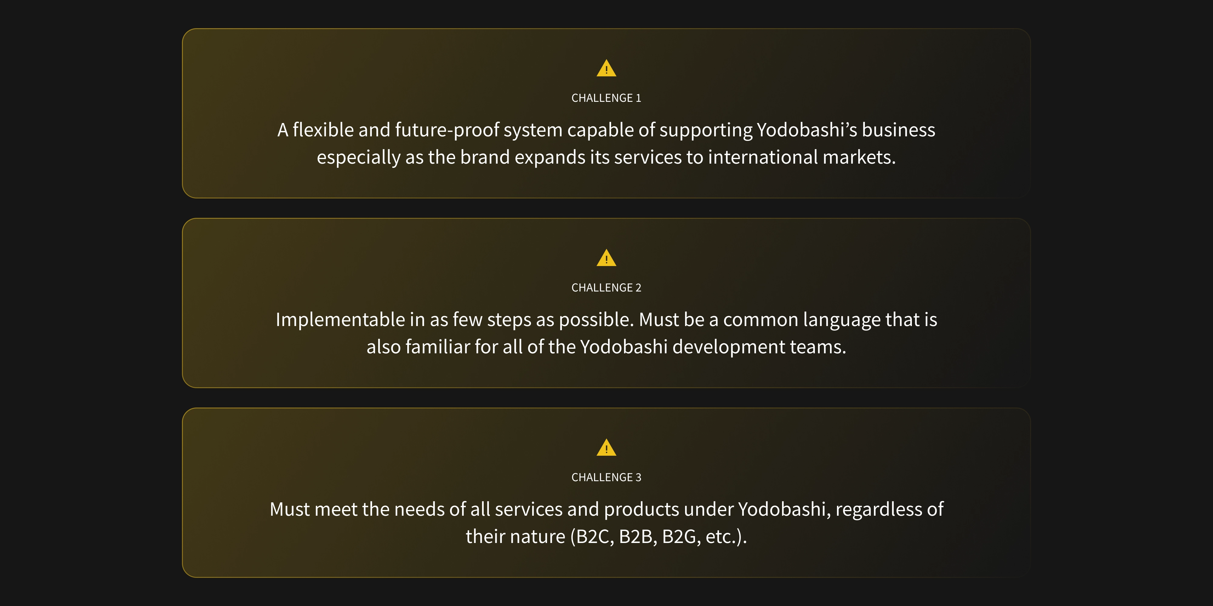
As each service evolved independently, inconsistencies in UI patterns, interaction quality, and visual language began to accumulate. Over time, these differences diluted brand equity, reduced cross-service familiarity, and made the broader ecosystem feel less cohesive than the brand itself. Yodobashi needed a unified design language that could scale across products, teams, and sub-brands—without slowing development or forcing a rigid “one-brand-fits-all” system.
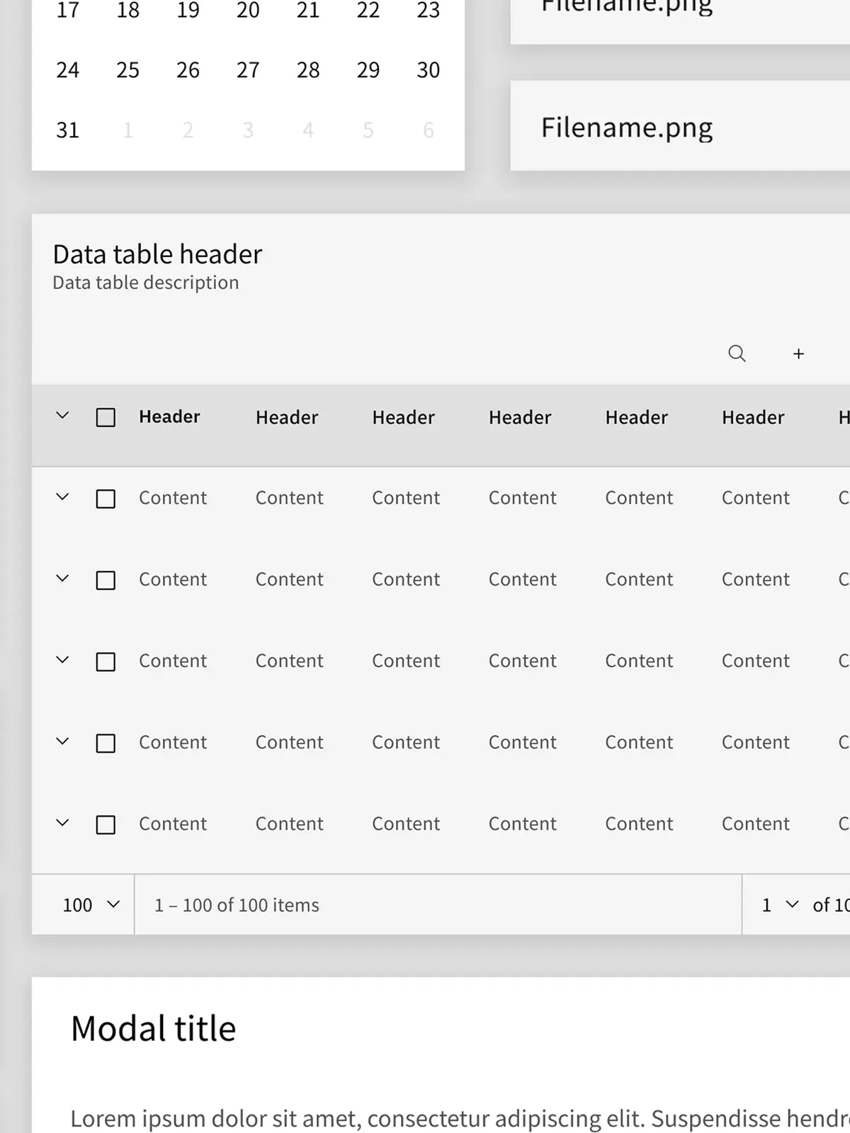
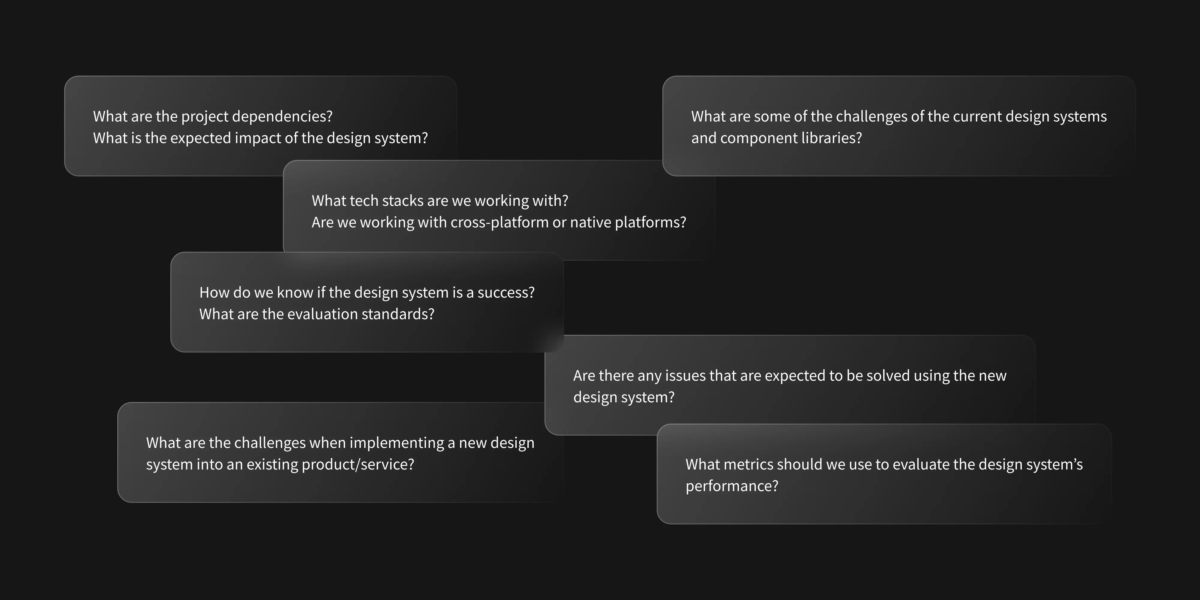
That led to the need for a flexible, multi-brand design system. But delivering it wasn’t an aesthetic exercise. It required aligning design, engineering, and business requirements across multiple product teams with different constraints, release cycles, and technical stacks. As the lead designer responsible for the design system’s conception and structure, I owned the core architecture and governance—balancing three competing demands: consistency, build velocity, and long-term portfolio scalability.